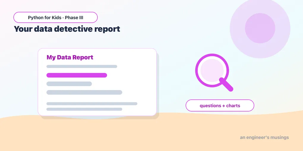
Capstone: A Data Detective Report
You’ve reached the end of Phase III! You can load real data, explore it, group it, and chart it. Now you’ll put it all together into a data report — exactly what a real data scientist produces: a few good questions, answered with numbers and pictures, plus what you learned.
Open this lesson in Colab💡 Work in your notebook, one cell at a time. Load the data and tools first:
import pandas as pd
import seaborn as sns
import matplotlib.pyplot as plt
penguins = sns.load_dataset("penguins").dropna()
The shape of a report
A data report answers a handful of questions. For each one: state the question, compute an answer, and (when it helps) draw a chart. Here’s a full mini-report on the penguins — read it, then build your own.
Question 1: How many of each species?
print("Penguins per species:")
print(penguins["species"].value_counts())

penguins["species"].value_counts().plot(kind="bar", color="teal")
plt.title("Penguins per species")
plt.xlabel("Species")
plt.ylabel("Count")
plt.show()
Question 2: Which species is heaviest on average?
avg_mass = penguins.groupby("species")["body_mass_g"].mean()
print("Average body mass (g) per species:")
print(avg_mass)

avg_mass.plot(kind="bar", color="coral")
plt.title("Average weight by species")
plt.xlabel("Species")
plt.ylabel("Body mass (grams)")
plt.show()
Question 3: Do longer flippers mean heavier penguins?
penguins.plot(kind="scatter", x="flipper_length_mm", y="body_mass_g", figsize=(8, 5))
plt.title("Longer flippers, heavier penguins")
plt.xlabel("Flipper length (mm)")
plt.ylabel("Body mass (grams)")
plt.show()
The findings
Finish with a short write-up — just print statements stating what you discovered:
print("WHAT I DISCOVERED:")
print("1. Adelie penguins are the most common in this data.")
print("2. Gentoo penguins are the heaviest species on average.")
print("3. Penguins with longer flippers tend to be heavier.")
That’s a complete data report: questions, evidence (numbers + charts), and conclusions.
Build your own report 🚀
Now make yours. Pick a dataset — the penguins, or tips/titanic/mpg from last lesson, or a CSV an adult helps you find. Then:
- Choose three questions you’re curious about.
- Answer each with a stat (
value_counts,groupby,.mean(),.max()…) and a labeled chart where it helps. - Save your best chart with
plt.savefig("my_chart.png"). - Write your findings as a few
printlines — three things you discovered.
Tip: build it one question at a time, in its own cells, and run as you go. When it’s done, you’ve made something real — show a parent or friend your discoveries.
What you learned in Phase III
You started Phase III barely able to open a notebook. Now you can:
- Work in Colab/Jupyter with cells.
- Load real data with pandas (
read_csv,load_dataset) and clean it (dropna). - Explore it:
head,shape,columns, select columns, filter rows, sort. - Analyze it:
value_counts,groupby,.mean()/.max()/.min(), new columns, record-holders. - Chart it: bar, histogram, scatter, line — with titles, labels, and color — and save it.
That’s genuine data science, done with the same tools professionals use.
What’s next: Phase IV
In the final phase, you’ll meet Artificial Intelligence. You’ll use AI that already exists (the computer recognizing a photo, reading the mood of a sentence), then teach a computer to learn from examples, and even train your own mini-AI — all in Colab. And here’s the secret: AI is built on exactly the data skills you just mastered. The detective becomes the teacher. See you in Phase IV! 🤖
Comments