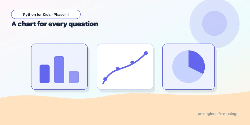
More Kinds of Charts
A bar chart compares categories, but data asks other questions too. How are the weights spread out? Do bigger flippers mean heavier penguins? Different questions call for different charts. Today you meet three more — and learn when to use each.
Open this lesson in Colab💡 Load the data and chart tool first:
import pandas as pd
import seaborn as sns
import matplotlib.pyplot as plt
penguins = sns.load_dataset("penguins").dropna()
Histogram: how are the values spread?
A histogram sorts a number column into bins and shows how many fall in each — the shape of your data:
penguins["body_mass_g"].plot(kind="hist", bins=20)
plt.show()
You’ll see most penguins clustered around the middle weights, with fewer very light or very heavy ones. A histogram answers “what’s common, what’s rare?”
Try it 🎯
Make a histogram of flipper_length_mm. Where do most penguins land?
Scatter plot: do two things go together?
A scatter plot puts one number on the bottom and another up the side, with a dot per penguin. It reveals relationships:
penguins.plot(kind="scatter", x="flipper_length_mm", y="body_mass_g")
plt.show()
Look at the cloud of dots: as flippers get longer (rightward), penguins get heavier (upward). Bigger flippers go with heavier birds — a real pattern you discovered from a picture!
Try it 🎯
Make a scatter plot of bill_length_mm (x) versus bill_depth_mm (y).
Line chart: a trend in order
A line chart connects points in order — best for things that change over time or sequence. Our penguins aren’t in time order, but you can still see the idea by sorting and plotting:
top = penguins.sort_values("body_mass_g").reset_index()
top["body_mass_g"].plot(kind="line")
plt.show()
Sorted lightest to heaviest, the line climbs steadily — a smooth ramp from the smallest penguin to the biggest.
Which chart for which question?
| Your question | Chart |
|---|---|
| Compare categories (how many of each?) | bar |
| How are values spread out? | histogram |
| Do two numbers go together? | scatter |
| How does something change in order/time? | line |
Picking the right chart is half of telling a good data story.
Predict it 🔮
To see whether longer bills go with longer flippers, which chart would you use — bar, histogram, or scatter? (A scatter plot — it’s for showing whether two numbers move together.)
Fix the bug 🐞
This scatter plot errors because it’s missing one of the two things a scatter needs:
penguins.plot(kind="scatter", x="flipper_length_mm")
plt.show()
(A scatter needs both x and y. Add a y, e.g. y="body_mass_g".)
Your mission 🚀
Answer two questions with two charts: (1) a histogram showing how bill_length_mm is spread out, and (2) a scatter plot exploring whether flipper_length_mm and body_mass_g go together. Write one sentence about what each shows.
What you learned today
- Histogram (
kind="hist"): the spread/shape of one number column. - Scatter (
kind="scatter", needsxandy): whether two numbers go together. - Line (
kind="line"): change over an order or time. - Match the chart to the question — that’s the skill.
Next time we make charts that anyone can read — adding titles, labels, and color, and saving them to share. 🏷️
Comments